Friday, 12 August 2011

shooting page

I really struggled putting this page together, firstly I originally had two pictures of the police officer on the left the first shouting whilst pointing his gun and the second is the one you see here, it didn't fit together having two similar images in a small space.

And I was planning on having an image of a city behind him and do it in a similar manner to my self conflict image but it didn't fit in with the left side of the piece so I decided to double up the background and mirror it, its colour (light, bright) represents the discharge from the weapon and joins both images up as if showing the path of the bullet.

This is an alternative where I was going with a forensic blue UV light look however it didn't go to plan on one side and I tried for a long time to correct it but I couldn't and therefore conceded defeat ( the right side looks great especially with the cityscape albeit the robber character did look a bit out of place when threshold-ed.) 

Thursday, 11 August 2011

Penultimate page

Throughout the story I try to keep the robber in the dark making him hard to see, as seen here by making him a silhouette by putting light behind him.  This is because both characters are played by me and to darken his face is to conceal the identity until the end.

I really like the abstract nature of the light, primarily because it is made up of paint stain and splatter marks but it work amazingly with the lens flare and complements it well.

I had to alter the lighting on both characters, darkening the cops back and brightening the front of him whereas the robber I had to darken his front and face considerably as he is facing away from the light.

Tuesday, 9 August 2011

Page 5

I really like how the character of the right turned out, especially how the skin is blacked out against the light and powerfully saturated orange.

The robber on the right came out wonderfully running towards the light at the end of the tunnel often seen as a cliche for death however I am using it as a path towards his escape.

For the character on the right (police officer) I had three photos that I was planning to use either using them al together by blending them in or singular.


I was mixing them and over lapping them to make a series of images that make an action (picking up the gun) however when they lapped over it looked not as good as the image I chose by its self

I chose to colour it warmly (right side) to oppose the left side which is dark and coldly coloured (blues). It creates a clear contrast between the characters I think as well as separating the page.

-------


I started by mapping out the perspective of the corridor like this, using just plain coloured geometric shapes; I used this technique on the second page to make the room with the sphere in it also.

Fight scene

This is the fight scene, I used motion blur on the fist and other parts of the body to represent motion, and used colour and luminosity to draw attention to certain parts of the piece. 
The second scene of them fighting (right side) is a negative, I inverted the colours and added a blending option to the layer so that the orange gradient behind it would effect it as it has done, I use blending options a lot in all of these pages, and is also feature behind the left side fight the paint splashes that look illuminated due to many layers being blended with white, to create a background that makes the character stand out. The gritty and messy paint splashes are a result of implementing the style of both Dave Mckean and Tim Marrs into my work which works really well and allows the dark clothed robber character to stand out against the black background and provide a solid silhouette for the character.

I think this is one of the most successful things so far and it is colourful without looking ridiculous or distracting.

What it previously looked like:
The colour was much subtler in this one not as bright or imposing. So I experimented in the way that I did on the previous page and made a glow behind the fighters and it worked well with the robbers dark outfit.

Sunday, 7 August 2011

First three pages


 Page 1
The first page had the character on the left side taken out as it didn't fit in with the rest of the image and stood out of place.
I use blending options on images such as warning signs and chain link fences to imitate the style of Tim Marrs throughout my work. I really like the strange aesthetic it provides to the piece, the brain scan image gives it some interesting dynamics in brightness and looks similar to a projection.

 Page 2

The second page was a big one and took probably the most time, firstly the room on the left I constructed out of  six images which are all just patterns, (marble for the stand, the green wall paper, the brown wall paper, the skyline through the window, the chequered pattern and the wooden frame behind it, all made just from images off of the internet) the rest is digitally painted, which I was rather proud of.

The wall which the robber is leaned against also is made of 2 images and painting, a wall paper pattern and a cracking pattern, which I blended together to only show the dark parts of the cracks picture leaving just the cracks themselves, and underneath all that it has digital paint the brushes look messy so that it makes the wall then look battered.

Also if you look at the room it has text layered over it to give some more information which blends in with the surroundings I got this idea from the American Psycho collage I done where the letters on the business card were blended into the image. The blue area on the right with the camera doesn't seem that fitting now in hindsight however I had a lot of trouble with that and it was hard to get that outcome to start with.
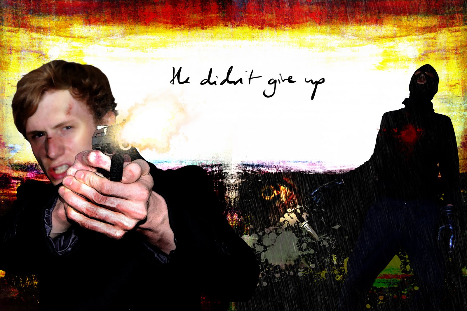
 Page 3

I really like how this one came out, so simplistic again the light in it was just by digitally painting paint splashes and stains of contrasting and complementary colours and layering them over one another and altering the picture until it had the right effect, I gave the object this glow to make it seem important and to draw the focus to it.
Page 3 alternative
This is the first take on it I made however I felt that the glow should be the same colour as the sphere so I added additional light blue and white layers with several other layers and blended them until I got a fluorescent glow.

Friday, 5 August 2011

Scene with influence of both Mckean and Marrs

I used an Image of an eye an overlaid it on the previous image, it creates a strange aesthetic, my reason behind choosing an eye is that I see it as what the robber is looking at (the centre of the eye, the pupil) and that is his focus and what he is there to steal.
Here shows the different ideas I had in mind (flooring being the example and the textures on the wall etc...) I was planning on doing the room alot bigger but it sort of came together this way I envisioned it as a big atrium of sorts with a glass roof and a reception however it was a little too complex.


Artist study: Dave Mckean

Dave Mckean is very interesting, he has a very strange style its very sketchy and imperfect, but its purposeful, its messy and that is partly why it is appealing it encompasses the page with tones and brushstrokes, the images overlap into over areas and allows seamless transitions between pages and a scenes, he puts several images together to make one, for instance he would create a scenes environment out of a photograph which he has taken of a paint stroke and then paint some more and photograph and then implement it into the background.

Such as this: http://www.flickr.com/photos/tralamander/5523385970/lightbox/

This allows him to put a large array of colour into just one image and blend it seamlessly.

Which I have been doing with some of my work lately especially on the last image I posted to make different textures and patterns.

This is another of Mckean's work a graphic novel called Arkham Asylum, which features batman.
However throughout the book he is never really seen directly or in detail, just vaguely and as a shadow, which mirrors what he is in a way.
I thought this sort of representation of the robber in my book would be good, giving him an ominous presence which also reflects what he is, if he can't be directly looked upon. 


Another scene from the book, without any text or other additions.

I made the image by selecting patterns and using them to create an environment, there are 7 different patterns/textures in this image, which are: Marble, 3 different wallpaper designs, wood, a chess board and a city skyline.

Firstly I mapped out the walls so that I could get the shape and perspective of the room right, and then added patterns to them, to get the texture of the floor and the grittiness on a lot of the surfaces I used a brush set which I downloaded off of the internet, which are a collection of splatters, stains and dirt marks.
Everything besides the images for the patterns is painted such as the light on the wall, and the ambient light coming through the window that lands on the floor, along with a lot of the shadows and lighting effects.

I intend on adding extra parts to it, and infusing Tim Marrs' style.

I liked this set up it looks good the only thing is the perspective may be a bit mess up with the room but its not to bad. I was intending on making it look like a art gallery.

Tuesday, 2 August 2011

Narrative - Typography

I think I may use my own handwriting for the text and input it via tablet I would have used a scanner if I had one however I don't.
I would do it from the perspective of the policeman, similar to a monologue.
The top two seem to have the right aesthetic, like they have been scribbled done on paper quickly, with a leaky blotchy pen.
My handwriting doesn't come out as naturally however when using a tablet.

So hopefully it comes out well through out the whole book or else I will have to resort to using normal text on photoshop, as a alternative I would think of using a typewriter-esque font, that which reminds me of noir detective films where they have to make typewriter reports on cases.

Use of Tim Marrs in my work - part 2

This piece I think looks much better than the last, its very simple but effective, this is meant to follow on from the last image as he has entered through the door.

I used a large brush stroke photoshop brush to create the dark spot around the bright door way, it is greatly simplistic however I really like the outcome, especially the way the glare from the door fills the most of the image.