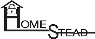
From my initial sketches I came up with these 4 logo ideas.
Firstly is this Homestead using the motif of a pad lock for security as well as joining the letters to show a structural strengthening to insinuate security of home and mind.
I like this how ever it isn't the best of the bunch, also it would take up unnecessary space on whatever it is printed on be it paper or packaging, perhaps if the words home and stead were aligned in a straight line it would be better.
This is very simple it spells out the abbreviation of the 'company' name IDD it states what that stands for in the journal pages, I liked this I was compact and clean however something about the I in the middle doesn't seem to work with the rest of the logo.
SafeHouses is the next I like this probably the most I fits together really nicely as the bottom of the S makes the middle of the H. It work really well with the slight elevation as well, which makes the S seem to come first in which it does in correspondence to 'SafeHouse'
Finally the first one I made and the only one made on photoshop.
The piece is a dichotomy in the sense that it is extremely simple however the concentric octagons play on the eyes if you look at it and seems very complex even though it is the same shape just smaller and darker within the previous shape.
Also I designed it with the aperture look as it similar in the design of a security camera lens.


No comments:
Post a Comment