Monday 31 October 2011

Front page revisited + extra variations in the style of Tim Marrs


As I said with the first rendition of this the text wasn't well placed or lit, certain letters were not visible and were too close to the hair of the police officer character.
I simply resized it and made it smaller and positioned it to the side and added extra colour in the background to illuminate it and make it readable.


Like my American Psycho piece I have done it with a white background giving the dark images a visual foothold and making them stand out.
These compared to the American Psycho piece is lacking in as many images but is equally as influenced by Tim Marrs, out of the two I prefer the one on the left as the composition is much better and the way it fits together looks much better than the other as the character at the top in the other one is obscured by the buildings which are the same colour, which is probably the main reason why. 
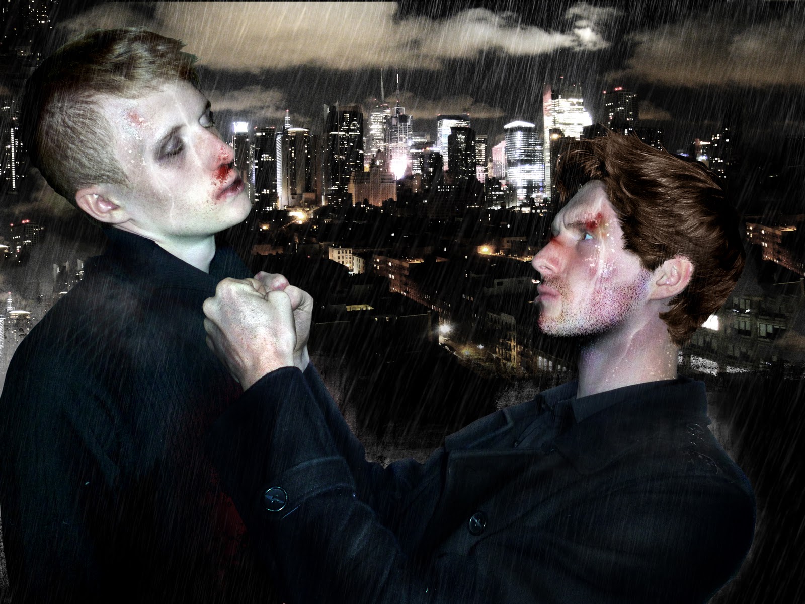
Theses two with the red and blue are meant to show the duality of the officer and the robber, as they are exactly the same however with a perverse differences being that one is on the right side of the law and the other not. Hence why I decided to make the red side damaged and destroyed to reflect the 'evil' of which resides in that character.
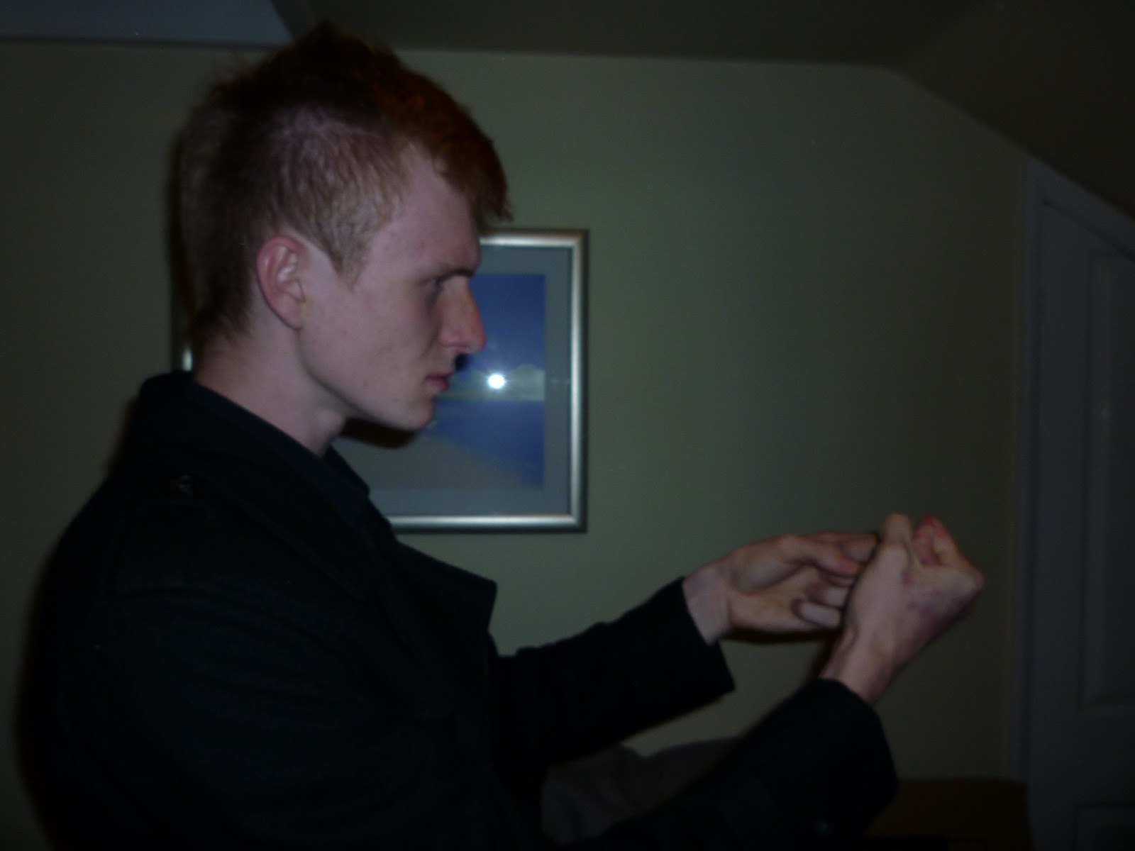
I added some water ripples on the one on the left to make it a literal reflection also.
I got the idea for this 'red & blue' piece whilst playing about with the images I used in the pieces above and then decided to experiment with it and create these also.

Out of all of them I like the most the red and blue piece as it is very simple but effective with the colours used to great effect representing the morality of the two characters and it also looks very professional in my opinion.  

Wednesday 19 October 2011

final page with text.

There was a consensus from a number of people after being shown this image that they thought the characters were two different people, when infact they are one, and that is intentional, so I thought it would help to make that more obvious with text that states that.

Monday 17 October 2011

Front cover for the book

Through out the book some of the pages backgrounds have been made of compiled layers of splatters and mark makings, which I edit so that it has an illuminating quality, which helps with the dark character outlines by creating clear silhouettes and allows me to experiment with lighting.

There are a few problems with this outcome, firstly the text is obscured by the darkness so some of it is not visible, and also the text seems too close to the head, so I am going to rearrange and add more background colour to make it more visible.

Alternative text.

I thought to produce a different text option would be a good idea as I could compare it to the previous (hand writing) and see which is better.
I went for a typewriter-esque font as it is a monologue narrative of which I would imagine being written into a diary or on a typewriter (which adds to the noir feel, as noir police films/books are set in an era where typewriters were common place such as the 50's.)

I more or less replicated the size and positioning of the original writing by overlapping them and then removing the handwritten piece so that it is very similar.


The last page I didn't add any text to show the speechlessness of the character, and to focus the viewers attention solely on the visual material making it that more powerful.

Sunday 9 October 2011

This is a variation on the last page, with the style in a similar vein to the rest of the book, I made a very dark and colourful image to mirror the possible feelings the character would be feeling, mainly anger which is associated with the colour red. 
The characters are made of two layers each as I had a dark image of them underneath where the only things visible was the skin and everything else was black, over the top of that I put a duplicate just made of geometric shapes and blended them together so that they both show simultaneously.
Here is a version without the geometric layer which was a red tinge, hence why this one is quite desaturated due to the lack of that layer.

I'm not sure which one I prefer better.

final page: climax

I thought I would use the style of my self conflict piece, it borrows heavily from it using rain and a dark cityscape for a background creates a very dramatic piece of imagery and a fitting ending to the book. I used a lot of effects in this piece, including : rain, water droplets on the skin, water trails on the skin, wet hair, dermal damage to the face of both characters, blood, rain splashes on the characters creating a mist, stubble on the cop.

I spent a lot of time to make make this seem very realistic, the hair on the cop is actually from another image I took when I had that hair cut I believe it is from the same photo that I cut the hand out of for the previous page. I had to bend and transform it to make it fit the head, then add extra parts in to patch up any bald spots by copying and pasting.

Here is the image I used for the cop, as you can see he needed a hair transplant to keep some kind of continuity.


I was very pleased with this page it just all fits together nicely and looks great.
However it is slightly different from the style of the rest of the book, but that might not matter too much, anyway I will make an alternative in that style also.

Photos for the final page

I decide that a side on scene would be best for the reveal of the identity of the thief, I plan to make it look like the cop has the lifeless robber by the collar and has lifted him from the ground to eye level and is left staring at his face speechless as the revelation that they are the same person is shown.
Alot of these photos I wasn't pleased with the expression on the face of either character, some looked stupid and ruined the mood of the scene.


This is possibly the best image which I will use as the cop lifting the character off of the ground, I have had my hair cut since so I will have to photoshop my old hair back on the character.


Death Page

This was the original way I was going, with a white background so that the blood stands out and it is made clear that he is actually deceased.
This looked fine however it didn't seem right, I also had ideas about doing like a homicide outline sort of thing with the blood like what is seen at murder scenes, however it didn't seem like it would work so I scrapped that idea. 
This is the final outcome for this page I got the idea to use a spotlight from one of the punk posters I made, it also insinuates that he is under inspection from the police officer as he is taking off his mask, it also seems similar to an post mortem. 
The blood I used about two layers each with blood splatter marks on and blended a darker one over the top of the other, then I duplicated just one of them and used a radial blur on it to make it look smudged (over his right shoulder.)
Here is the photograph I used for the police officers arm, I didn't want to include his head in the image as I wanted the main focus to be the body of the robber and also because I now have a different hair cut so I wouldn't have looked right if I took a new photo. This photograph was originally intended to be used after the fight scene where he picks his gun back up after it being knocked out of his hand, but the way I formatted my book with only one main image per page didn't allow for the use of a lot of my photos.

Friday 7 October 2011

Death Page photos


I took a large amount of images for this scene, I planned on doing an image showing the death of the robber and his mask being taken off leaving it open for the next page to reveal his identity.
As I was playing the character I got my brother to take the shot I told him how to do it, he firstly took a few at the wrong angle (the first 3 images) I then instructed him to change the height and angle of the shot therefore you get a good view of his body and face ( of which is still slightly concealed.)
I done several versions, with the mask, with the mask half off (up past the mouth) and without the mask. just incase I needed multiple images showing act of his mask being taken off. 


This is the image I am going to use, I like how the mouth is slightly ajar which shows his deceased state, also the angling of the body work well, going into the top right corner.