Wednesday 29 June 2011

Variations of characters/styles based upon previous photographs


This photo looks very poor before I added any edits As seen in the final poster it looks a lot better mainly due to the addition of strong lighting.


Experimenting with cartoon style effects, they didnt work as well as I had hoped so I tried making it myself as seen below, it worked nicely but it was not what I was looking for.


This last one I really liked it is very dark and almost scary looking however the badge on his chest shines through the dark areas on his jacket which I thought worked very well.

Sunday 26 June 2011

Burglar and Police photos

I started by taking photos in various poses both for a burglar and police detective, each with their own costumes,

ROBBER

The expression on the face is a bit silly on this one so I will decide against using it.


A lot of these initial robber photos were very good however some were to similar such as this and the one below.


This photo above is I believe,  the best out of the lot, the posturing of the character is very nice and gives him a heroic composure, which is contradictory to who is actually is.
I added leather gloves as it seems like something a criminal would wear to avoid leaving finger prints.


These cloud formations I took outside my window at the top of the house so all I had was the sky above me and the results were interesting, it allowed me to capture a great expanse of sky and a massive looming over cloud.


The colouring on this one seems a bit off giving the clouds a horrible yellow tinge.


This is a better version that the one above, even if it could've been changed in photoshop it is good to have a original photo that doesn't need much changing.
These cloud images I plan on using as part of the backdrops to my work for the sky.

COP

I put on a entirely different out fit and combed back my hair but left it wet and messy to give me a rugged but believable police officer look.
This above was a good photo however I wanted one with a gun or a cigarette in his hand so I decided not to use this one.

Again this image I wasn't pleased with the way I was standing so I do not think I will be using it later on in the project.

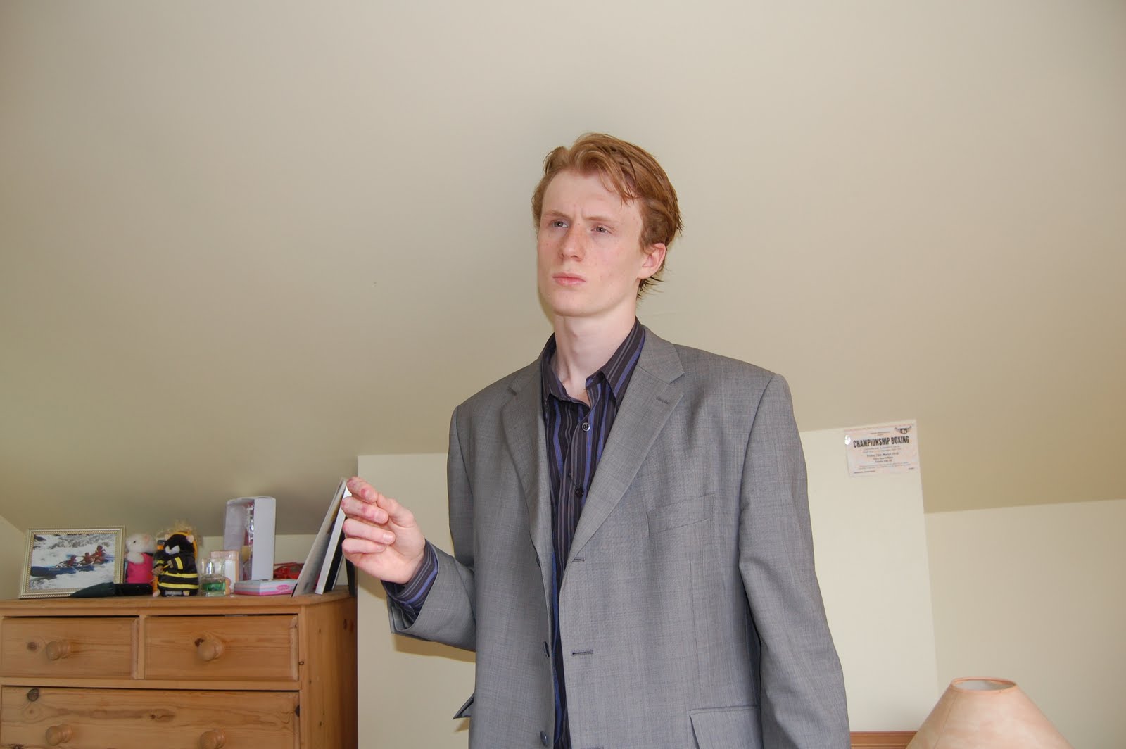
This is a good photo in my opinion, I left the hand up so I could insert a prop, such as a gun or cigarette.
To certify that he is in-fact a cop and not just a mysterious looking man.

COP 2


Unfortunately  these images were out of focus, however the posturing was good and I had plans to use this in a very cheesy way, similar to a james bond poster...


again this is out of focus and the posturing I didn't like compared to the one before.

This above however I really like it is a tiny bit out of focus but not as much as the others, I like the soft lighting and by far it is the best out of the 3 when it comes to positioning of the character.

This photo works very well the lighting from the window in front of me (not seen in the photo) is giving some nice natural lighting and helps make it seem more dramatic and depth in the image by producing shadows and highlights on the coat and face. Similar to the lighting in the photo above.

This is the best pose out of the mid range shots of the cop character however it is completely out of focus much like those below it, If it wasn't it would've been a great photo and my choice in the future of this project.

Out of focus and over exposed slightly, again a shame as it would've been a good image to use.
Largely down to my lack of experience with the SLR cameras at the time.

Similar to the others where it is ruined by lack of focus in the photos.

ROBBER 2

A variation on the robber outfit with a leather jacket, and more of a sinister pose.
However the face I didn't like at all.

More of the same as above but from further away, I thought it best to fit the whole body in in order to implement it into a environment

This is possibly the best robber 2 pose addition of gun certifies that he is a criminal, a more relaxed pose but it works and the lighting on the jacket is good with reflections and defined dark patches.


Friday 24 June 2011

Final logo decision


SafeHouse
Out of all of my logo designs I like this the most, it is rather simple and minimal but it works well the S makes up the mid section of the H, and it is easily connectible to the name of the company and the logo being the 'initials' of the company.

It could be easily used as a letter head and placed on products and into advertisements without being to crowded or looking out of place.

Thursday 23 June 2011

Final logos

From my initial sketches I came up with these 4 logo ideas.

 Firstly is this Homestead using the motif of a pad lock for security as well as joining the letters to show a structural strengthening to insinuate security of home and mind.
I like this how ever it isn't the best of the bunch, also it would take up unnecessary space on whatever it is printed on be it paper or packaging, perhaps if the words home and stead were aligned in a straight line it would be better.
This is very simple it spells out the abbreviation of the 'company' name IDD it states what that stands for in the journal pages, I liked this I was compact and clean however something about the I in the middle doesn't seem to work with the rest of the logo.

SafeHouses is the next I like this probably the most I fits together really nicely as the bottom of the S makes the middle of the H. It work really well with the slight elevation as well, which makes the S seem to come first in which it does in correspondence to 'SafeHouse'

Finally the first one I made and the only one made on photoshop.
The piece is a dichotomy in the sense that it is extremely simple however the concentric octagons play on the eyes if you look at it and seems very complex even though it is the same shape just smaller and darker within the previous shape.
Also I designed it with the aperture look as it similar in the design of a security camera lens. 

Wednesday 22 June 2011

notepad pages on logo design


I started by looking at pre-existing security logos (my theme) and what they have in similar, what works well and the different styles or the not so different in their design.

I then brainstormed some ideas as to the imagery which would go with the theme (security) I came up with a lock, bars, a robber mask and a house to use as motifs.

This is basically the ideas derived from the ideas (motifs) I came up with on the last page and just played around with certain styles and designs to get a varied group.

From this I had to branch out and create a very different piece but some how related to the theme of the logo project, here are some of the ideas I thought of.

Film poster

Advertisement for the company

Wanted poster for the robber 

Tongue in cheek instruction manual.

Different stylisations which I was intending to use in a Saul Bass-esque way however I never got around to it.

Here is an unfinished piece in that style:


Finished piece:


concept of movie poster background.
See below for photoshop version.

example of the background to the movie poster (prototype using secondary images).
For what it is even unfinished I really like this its moody and looks like a serious movie poster, However I had to press on with my own ones.


Another concept for the arrangement of the movie posters

Short story featuring a punk which I will use for my comic book later.