This first set were good however they were far to dark, possibly due to the exposure on the camera being low.
I tried to place the robber in sneaky poses or ones of caution as you would be if you were stealing or trespassing.
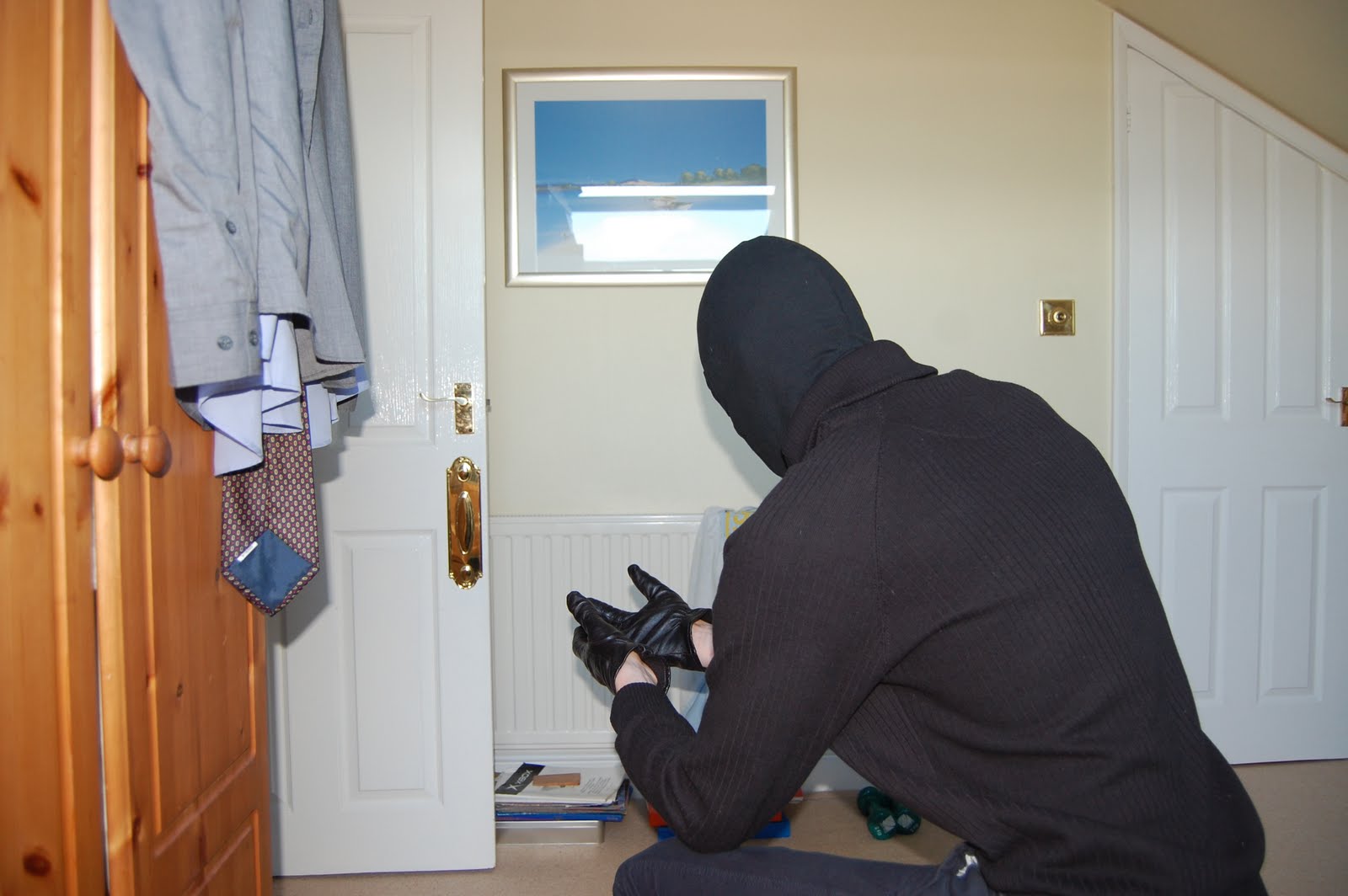
I added a black jumper to the character in order to keep the realism of the idea of sneaking about as you wouldn't do it in a big white and black stripy long sleeve shirt.
These of him from behind are intended to be the robber holding something which he is stealing
it offers a change of camera angle something which I believe adds a cinematic quality hopefully.
I was trying to get the focus on just the hands however it ruined the rest of the image by blurring the character too much, as seen below as well.
Thanks to my self conflict piece I knew how to create an impressive fight scene, so I knew just what to do when it came to placing one in this piece all the photos have corresponding reactions from the other character and vice versa.
These are intended to have the robber fleeing I choose to do it away from the camera to add more dimensions to my work instead of having everything on one plane from left to right, I am going to have him going further away from the view down a corridor.
These below were the photos I took of him running on a horizontal plane however it looked terrible and to static so I decided to do the others above this one which worked much better than these ones.
I thought it would be good to get loads of variation in poses just incase I wanted some sinister looking poses and these static ones work rather well.
below is the death scene and the characters reaction to gun wounds.
COP photos
I like how these images came out the focus is on the gun and slightly blurs out the police officers face.
I tried to make it look as if he is saying freeze, before he reluctantly shoots the robber.